
About this site
Site design and principles
How this site looks, and why. Everything here comes from the Foundation's seal and serves one aim: a site every neighbor can read and use, on any device.
Principles
What every page on this site is held to, whoever builds it.
Principle 1
Built for neighbors, on their phones
Most visitors read on a phone, so running text is 17px and nothing is smaller than 13px. Every page works at phone width, and your own text-size setting always applies.
Principle 2
Everyone can use it
Every page meets WCAG 2.1 level AA: text at 4.5:1 contrast or better, tap targets at least 44px square, a visible focus ring, full keyboard use, landmarks and a skip link. Where a map is the way in, there is a list too.
Principle 3
Calm, with color that has a job
Ninety percent of any page is neutral. Coral appears only where you can act, teal only where you can go somewhere or should read something, and status colors only for state.
Principle 4
Nothing moves on its own
No carousels, no autoplay, no animation you didn't ask for. If your device asks for less motion, the site turns its transitions off.
Principle 5
Plain words
We write as "we" to "you", in sentence case, without police jargon. A button says what it does: "Donate $50", never "Submit". Links are always underlined, so they never rely on color alone.
Principle 6
Private by default
We keep only what a feature needs and never sell it. Visitor statistics set no cookies. An address you type into the Province Finder is never stored, and your preparedness plan is yours alone.
Principle 7
Nothing goes out by accident
Every story, document and page starts as a draft, and appears on the public site only when someone allowed to publish it does.
Principle 8
A page never breaks for want of content
If a page's text has not been written yet, or can't be read for a moment, the page still shows its title and everything else it has.
The seal and photographs
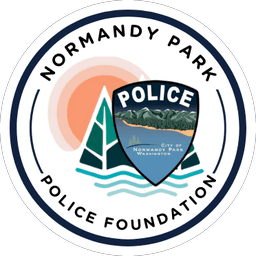
- The seal is the Foundation’s only mark, and every color on the site comes from it. It sits beside our name in the header at 48px, and appears at 64px or larger everywhere else.
- It is never recolored, cropped, shadowed, or set on coral or on a photograph.
- The police patch inside it belongs to the City of Normandy Park, and is never used on its own.
- Photographs carry no text and no overlays. Where white text needs a band of color, it sits on the seal’s deep teal. The one exception is the home page’s banner, under a navy wash.
- Every photograph has a description for people who can’t see it.
Color
Ninety percent of any page is neutral; color has a job. Each interface color is named for its job, and has a value for light pages and one for dark, which the site follows from your device. The left half of each swatch is light, the right half dark.
Surfaces
Paper
The page itself
- Light
- #F6F8F9
- Dark
- #0A1526
Surface
Cards, panels and fields
- Light
- #FFFFFF
- Dark
- #112241
Surface 2
Table headers, the breadcrumb and tag chips
- Light
- #EAF0F2
- Dark
- #1A2E52
Sunk
The footer
- Light
- #E2E9EC
- Dark
- #060E1A
Lines
Soft rule
Hairlines inside a card
- Light
- #DCE4E8
- Dark
- #21385C
Rule
Card edges and the rule above a section
- Light
- #B9C7CD
- Dark
- #34507A
Strong rule
Field outlines, which must stand out at 3:1
- Light
- #687A86
- Dark
- #7189AB
Text
Ink
Body text and headings
- Light
- #112241
- Dark
- #EEF2F6
Ink 2
Ledes, captions and metadata
- Light
- #3B4C63
- Dark
- #B8C5D3
Ink 3
The quietest text, still 4.5:1
- Light
- #566679
- Dark
- #9AA9BB
Action: the seal's coral
Action
The primary button's fill. A fill, never text
- Light
- #F99770
- Dark
- #F99770
Action hover
The primary button under the pointer
- Light
- #FBAD8D
- Dark
- #FBAD8D
Action line
The masthead rule and the current page's underline
- Light
- #C0582F
- Dark
- #F99770
Action wash
Selected filters
- Light
- #FDE8DE
- Dark
- #3A2720
On action
The label on a coral fill: navy, never white
- Light
- #112241
- Dark
- #0A1526
Teal: go somewhere, read this
Link
Links, secondary buttons, callouts and the focus ring
- Light
- #005E52
- Dark
- #7DD3D9
Callout wash
The ground of a callout
- Light
- #E1F1EF
- Dark
- #0F3438
Status
OK
Done, saved, confirmed
- Light
- #1F5F35
- Dark
- #7BD49A
OK wash
Behind a success message
- Light
- #E3F2E7
- Dark
- #12301F
Warn
Check this before you go on
- Light
- #8A5300
- Dark
- #F5BB7B
Warn wash
Behind a warning
- Light
- #FCEFD9
- Dark
- #3A2C14
Stop
Errors and actions that delete
- Light
- #B42318
- Dark
- #FF8A80
Stop wash
Behind an error
- Light
- #FCE8E6
- Dark
- #3D1A18
The seal’s colors
The seal’s own colors stay the same in both themes. They are for illustration, charts, the Province Finder’s map and the band behind white text. Coral, aqua, sky and teal mid are too light to be text.
Navy
#112241
Our ink, and the seal's ring
Coral
#F99770
The seal's sun. A fill, never text
Peach
#F7C4B1
Blush
#F5E2DE
Teal
#005E52
Our links
Teal mid
#008A7D
Never text
Deep
#003238
The band behind white text
Aqua
#01A9B8
Never text
Aqua light
#A1D2D7
Sky
#568FB7
Never text
Sand
#F5BB7B
Contrast we promise
Text stands out from its background by at least 4.5 to 1, and lines that matter, such as a field’s outline, by at least 3 to 1, in both themes. Every pairing the site uses is measured each time the site is built; these are a few of them.
| Pairing | Light | Dark | At least |
|---|---|---|---|
| Body text on the page | 14.8:1 | 16.3:1 | 4.5:1 |
| Ledes and captions | 8.2:1 | 10.4:1 | 4.5:1 |
| Links | 7.2:1 | 10.6:1 | 4.5:1 |
| The label on the primary button | 7.3:1 | 8.4:1 | 4.5:1 |
| Text in a callout | 13.6:1 | 11.9:1 | 4.5:1 |
| An error message | 6.6:1 | 6.9:1 | 4.5:1 |
| A field's outline | 4.5:1 | 4.4:1 | 3:1 |
| The coral masthead rule | 4.2:1 | 8.4:1 | 3:1 |
Type
Lora is the only typeface, for headings and text alike. Running text is 17px with generous spacing, nothing is smaller than 13px, and a line stops at about 68 characters.
Display
36–48px
The page's one main heading
Neighbors looking out for each other
Heading 2
26–32px
Section headings
Get ready for the next storm
Heading 3
24px
Subsections
Build your supply kit
Lead
20px
Ledes and card titles
Plan for seven to fourteen days on your own.
Body
17px
Running text, buttons, navigation and fields
Normandy Park has always been a community where neighbors look out for each other.
Small
15px
Help text, table cells and card text
We'll email your receipt as soon as your gift goes through.
Caption
14px
Captions, credits and dates
Shop with a Cop, December 5, 2026
Label
13px
Eyebrows and table headers, in capitals
Get involved
Code
System monospace
Receipt numbers and door-card codes, nothing else
D2026-000123 · K7QM-4XPR
Space and shape
Spacing grows in steps from a 4px base. Pages are at most 1,180px wide, with a 16px margin on every side that never closes up.
Spacing
- 4px
- 8px
- 12px
- 16px
- 24px
- 32px
- 48px
- 64px
- 96px
- 128px
Corners
4pxFields
8pxButtons, cards, panels, callouts and dialogs
RoundTag chips, photographs of people and the seal
Elevation
Elevation 1
A card at rest
Elevation 2
A card under the pointer, and anything that floats above the page
Components
The pieces every page is built from. The samples here are the site's own components; the controls are pictures, so they do nothing.
Buttons
Every button is at least 44px tall, with 8px corners and a label that says what happens, with a verb and an object.
Primary: coral with a navy label, for the one most important action on a screen. On most pages it is the header's Donate.
Secondary: a teal outline, for any other action.
Quiet: no brand color, for cancel, back and filters.
Destructive: outlined in red, and always behind a confirmation.
Links
Links are always underlined, so they never rely on color alone, like this link back to our principles. Focus anything with the keyboard and a 2px teal ring shows where you are.
Callouts
A callout has a full 1px edge in its color and a wash behind it, never a thick bar down one side. Its words stay ink.
Before you start
The Province Finder looks up your address and never stores it.
Thank you
Your gift went through, and your receipt is on its way.
Waiting
A volunteer will confirm your address, sometimes with a card at your door.
That code doesn’t match the card
Check it and try again: 2 tries left.
Fields
A field has its label above it, help text below, and an error that says how to fix it. Fields have 4px corners and an outline strong enough to find.
Where you live in Normandy Park.
Enter an email address like name@example.com.
Navigation and tags
The header holds no more than six places and a search. The page you are on is marked in ink, bold, with a 3px coral line beneath; tags are round chips.
- About
- Blockwatch
- Paws on Patrol
- News
- Blockwatch
- Shop with a Cop
- Paws on Patrol
Tables
Like the tables on this page: a caption, capital-letter headers on Surface 2, hairlines between rows, figures that line up, and room to scroll sideways on a phone.
Motion
Nothing on this site moves on its own. Things move only when you ask, quickly, and if your device asks for less motion, every transition is switched off.
| Speed | Duration | Used for |
|---|---|---|
| Fast | 120 ms | Hover and focus |
| Base | 200 ms | Opening and closing a section |
| Slow | 320 ms | Dialogs and menus that cover the page |
Voice
We write as the Normandy Park Police Foundation, "we", to you, "you": plainly, warmly and in sentence case, the way a neighbor would.
| Rule | Write | Instead of |
|---|---|---|
| Say what a button does, with a verb and an object | Donate $50 | Submit |
| Speak as we, to you | We'll email your receipt. | The Foundation will email the donor a receipt. |
| Use sentence case | Ask to join Blockwatch | Ask To Join Blockwatch |
| Write dates in words, the American way | August 4, 2026 | 04/08/26 |
| Leave out police jargon | Going away? Ask the police to check on your house. | Request a premise check from patrol. |
| No exclamation marks or emoji in headings | Thank you for your gift | Thank you!!! |